Posts

Showing posts with the label blogger theme

A Look at You - The Lunatics Who Read These Posts - January 2022
Image
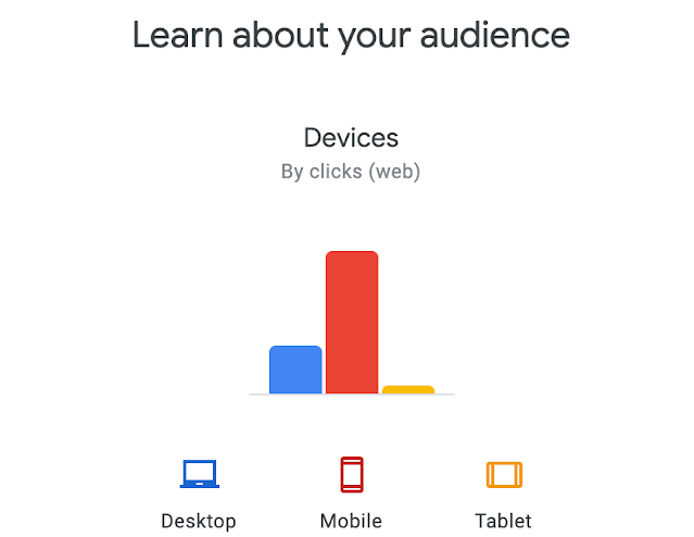
I was doing a little thinking/looking at this here online Weblog (or diary as I like to think of it) as it relates to the template.  It has been a number of years since I've done any real housekeeping and moving things around.  As part of that process, I thought I'd let some of the data lead the discovery process to understand how most of you are engaging with my diary.  First...let me say that I continue to be amazed that ANYONE reads any of these posts.  I do ZERO promotion of the blog.  I have no ads and cater the posts/topics to an audience of one:  me.  I write MOSTLY as a resource for my own sanity - and to flex my own publishing muscles.  Seth Godin calls it SUSDAT .  I call it SUSDAP.  Shut up, Sit down and Post.  Every.Single.Day. But, what are *most* of you using to read these diary posts?  By a large margin, you lunatics who are here are reading this post (and everything else) on your mobile device.   And, ...

Some Spring Cleaning On The Blog Template - Fonts, Header, Colors

Image
If you look around here on the blog, you might have noticed a little bit of updates.  Call it 'Spring Cleaning', but a few weeks ago, I ended up updating the fonts site-wide to Roboto, tweaked some of the colors (Blog title, tags, tabs) and added a header photo.  You can see the screenshot of the blog above that includes that header photo of the new set of Frans Fontaine Hornbeam Trees that I recently put in. The last time that I update the look of the blog was back in March of 2017 when I added this responsive template that was mostly blue . While this isn't an exhaustive look at the process, this is the (at least) 11th documented version of the blog over the years.  Here are the first nine versions of screenshots that I have from 2004 to 2016 .  And here's the 10th and most recent .  The fonts are an improvement (imho - and that's 'humble' for sure, btw !), but the real improvement is the header photo.  It personalizes the site a bit, as one of N...

New Theme for The Blog

Image
It was just over a year ago that I posted a new blog theme redesign here on "Why I Oughta..." and showed the previous 12 years or so of what the blog has looked and felt like over the various changes.  If you're reading this in your email, you're likely unaware that I've made another switch recently.  Go ahead...click through on the title of the post in your email and you'll see this blue theme below.  This is one of the new(ish) themes that the team at Blogger released recently . I'm certain that there have been more, but this is the 10th *documented* version over the past 13 years .    I've streamlined things a bit by removing any and all ads as well as the 'you might like' feature boxes.  And for the first time in I think ever, I have only one column. Here's the full length screen grab, but because of the scrolling and the resizing of the header image, you'll see the white band across the photo in the top post.