Posts

Showing posts with the label inspiration

What About A Micropond? Garden Inspiration Via TikTok - November 2024

Image
I've found myself drawn to a creator on TikTok named "Artful Roger" who combines his love of gardening with his other interests (like building miniature things, vintage Christmas and interior design).  I'm much more likely to 'swipe' up/past the miniatures/interior/tablescape design videos, but I never skip one of his garden TikToks.  And...as I've shown...I'm a sucker for Vintage Christmas.   In a series of videos, he posted about how he created what he calls a "Micropond" in his backyard.  Here's one of the videos showing the completed project - linked here - and embedded below: @endtable Here are the pond details. #micropond #gardenpond #waterfeature #gardenwaterfeature #artfulrodger #gardeningbasics ♬ Happy - Calming Tune The photo at the top of this post is a screenshot from that very TikTok.  There's a lot to like about this.  Boulders that he found on-site.  The use of mixed materials like the driftwood.  Pea grave

Inspiration and Ideas on Edging - Via Moxie Gardens YouTube - November 2024

Image
With the growing season winding down, I'm turning my attention to a couple of things:  chronicling the lessons learned from this past season AND thinking about what I could do NEXT season.  This post is to put down a marker for next year - with something I've come across via YouTube:  Edging.   I've posted some photos/inspiration of edging over the years including this metal edging from Luxembourg Gardens in Paris , this metal vs. brick edging view in 2019  and this boulder edge at a nursery .   Moxie Gardens is a YouTube Channel of a gardener/landscaper who lives in Kansas (I think) and has built a personality-heavy backyard garden with LOTS of unique touches.  One of them is his use of various types of edging.  Here's a video - and screenshot below - that shows how he used 4x6 posts cut-up to different heights to create a curved edging around his patio.  Here's the 275 second mark with this view: Screenshot v ia Moxie Gardens video And, here's another look

Garden Bed Edging Inspiration: Boulders To Divide Bed From Neighbor

Image
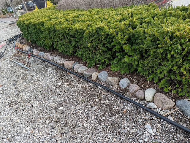
We have a bed that lives *right* on the property line in the IB2DWs area that has never had a real, proper edge other than the one that we dug with a spade.  The issue is that there's a little bit of elevation change - by design - between the two properties.  My plan for this season is to make that bed feel a little bit MORE finished by removing some sod, shaping the bed a little bit and edging it along the property line in some way.  This bed runs up against a tiny strip of grass next to my neighbor's driveway, so I'd like SOMETHING to keep the mulch from running/floating over onto their driveway. I've thought about using the green metal edging that I used for our gravel paths.  But, Nat doesn't love it.  She wants something that works with the existing gravel, so I decided to start to keep my eyes open for edging that works to divide mulch beds from gravel and hard surfaces.  It wasn't long until I saw something like this below: And, then...something similar l

Backyard Pizza Oven Inspiration - 2019

Image
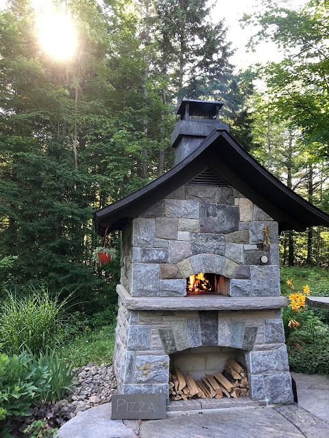
Not my photo.  Not my pizza oven.   Found it here online . Over the years, I've posted about my pizza oven dreams.  Backyard pizza oven dreams.  All the way back in 2010, I posted this photo of what I THEN called my "Dream Pizza Oven" .  And in 2011, I posted another photo that showed off a little 'roof' out front of an oven that I collected as inspiration.  That's close to ten years ago, so this *dream* has been going on for a while - as far back as our original house in Elmhurst.  But, when we moved, the backyard pizza oven dream didn't die and I even posted about the various locations that I could put it here on the blog .  And that brings me to today and *this* oven that you see above. I came across it online last week and have revisited the photo a few times now.  To be totally clear, that is NOT my photo above.  You can find the original here .  But, let's look at a few things that jump out to me in terms of pizza oven inspiration.  Fir

Nostalgia At Disney - Seeds Being Planted

Image
I came across this little display and sign inside of the City Hall in the townsquare at the end of Main Street USA at Disneyland Park on our trip.  It is titled "Yesterday" and speaks to the idea of nostalgia.  Written/said by Imagineer Bruce Gordon.  I had never heard of him, but he was an Imagineer who died pretty young - at the age of 56 - back in 2007 .  His work includes the creation of Splash Mountain, the 1998 renovation of Tomorrowland, the Many Adventures of Winnie the Pooh, the Finding Nemo Submarine Voyage and Tarzan's Treehouse. Some Disney purists might look at his resume and think he's, ah...associated with some terrible projects.  The 1998 Tomorrowland renovation was panned .  The Tarzan Treehouse conversion from Swiss Family Robinson certainly has detractors.  Same with the Nemo submarine voyage.  Changes to "classic rides". But, this Mercury News piece - which ranks the best and worst Disney ride/attraction makeovers lists Nemo as a w

Even More Vestibule Tile Inspiration Courtesy of PizzaRizzo

Image
All the way back in November, I shared a photo that showed off square tiles, set in a pattern that was from the queue of a ride that I thought might serve as good inspiration for the tile in our vestibule .  Just a week or so ago, I came across another tile pattern that stopped me in my tracks.  That's it above.   This is the ordering section of the new PizzaRizzo restaurant and as you can see above, is a mix of a main pattern and a few borders.  This uses both hexagons and squares.  Check out the close-up below to see how the hex's and the squares work together.   I'm out of the tile-selecting business (that's Nat's territory), but knowing she's a reader, here's hoping that this will influence her a bit in one of these directions.  She's already ruled out my first choice:  which was to put our last name in tile.  Then I wanted the house number.   Kinda like this .  Or even this with it smaller in one corner of the vestibule .   But I th

Vestibule Tile Inspiration Via Peter Pan Queue

Image
As we begin the *actual* building of our new old farmhouse (gasp!  Could *it* really be happening??  Appears that way, but I don't want to jinx us...), we now begin to move from the 'drawing phase' to more of the real, actual, 'selection phase'.  That's where Nat reigns and is in control of everything from the big decisions to the smallest detail.  We find out more this week in terms of schedule and such and will be updating our farmhouse blog in short order. But, as I know she reads the blog here, I figure I'll use this platform to try to influence her and persuade her to something I'm keen on:  this tile as seen in the queue in the Peter Pan ride at WDW. In our house at Hilltop, we have designed a vestibule of sorts right inside the front door before you enter the hallway.  If you've been in a period house from 100 years ago, you know the type.  Think about something like this .  Usually has an 'inside' door and serves as a sort of a

Our Job Isn't To Give Clients Exactly What They Want...

Image
This slide was presented at the meetings that I referenced yesterday up in Toronto and really struck a chord with me during the week.  It is the typically bawdy, brash talk that happens at these type of internal rah-rah's, but in thinking about it:  if I was a #client, I'd want my partners to embrace this philosophy.  To me, it means bring scrutiny to every engagement and making sure that we're doing the BEST every time - even it if means a tougher road to go in terms of team structure, time needed, outputs, etc. Our job isn't to give clients exactly what they want.  It's to give them exactly what they need.