Posts

Showing posts with the label design

Getting To Know Morton Arboretum Fragrance Garden Seasonal Beds - August 2023

Image
I had to pick up one of the kids at the Morton Arboretum recently had had a little bit of time to get some steps in and decided to go see the Fragrance Garden up by the Thornhill Center on the West side of the Arboretum .  It is a spot where you can park pretty close and get to see some beds and containers on a quick little, easy walk.  A couple of years ago, I was in this same garden and posted some thoughts and photos here .  At that time, I was struck by the bedding plants and combinations they had in what felt like a very shady garden (which...is a lot like our own garden).    It was from that experience that I said (to myself) that I needed to think about using annuals beyond the container - as bedding plants - in the shade.  In fact....that was one of my 2023 to-do items and the push behind all of the annuals that I planted this year including some Lobelia, Begonias, Impatiens, Polka Dot Plants .  The beds at the Morton Arboretum have inspired me...

A Look at You - The Lunatics Who Read These Posts - January 2022

Image
I was doing a little thinking/looking at this here online Weblog (or diary as I like to think of it) as it relates to the template.  It has been a number of years since I've done any real housekeeping and moving things around.  As part of that process, I thought I'd let some of the data lead the discovery process to understand how most of you are engaging with my diary.  First...let me say that I continue to be amazed that ANYONE reads any of these posts.  I do ZERO promotion of the blog.  I have no ads and cater the posts/topics to an audience of one:  me.  I write MOSTLY as a resource for my own sanity - and to flex my own publishing muscles.  Seth Godin calls it SUSDAT .  I call it SUSDAP.  Shut up, Sit down and Post.  Every.Single.Day. But, what are *most* of you using to read these diary posts?  By a large margin, you lunatics who are here are reading this post (and everything else) on your mobile device.   And, ...

Disney Imagineering Design Contest And A Local Connection

Image
Recently, I saw on Twitter that the folks at Walt Disney Imagineering awarded winners in their annual student competition called Imaginations .  You may have heard of Imagineering, but they're the team who designs and builds the experiences in Disney Parks and Resorts.  But, you are probably like me and have not likely heard of the "Imaginations" competition.  The themed design competition opens up an opportunity for college students across the country to showcase their skills and thinking to the amazing collection of creative talent at Walt Disney Imagineering (and hopefully learn some things along the way). They've done this for 29 years and it was started in 1991 by Disney Legend Marty Sklar.  From the release on the winners : For nearly three decades, Imaginations has served as a prestigious design competition with the purpose of discovering and nurturing the next generation of Disney Imagineers from a diverse array of disciplines and skillsets. Founded ...

Manhole Cover From Ginza Tokyo

Image
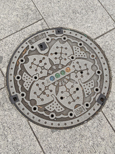
Just like street trees , there's a whole world of Web content related to manhole covers in Tokyo .  And for good reason.  Above is a photo of one of the many covers that I came across on my walks around the Ginza neighborhood on my recent trip to Tokyo.   Based on this post from Japan Visitor , is either a combined sewage system or water supply cover and has the four icons in the middle light up in colors of orange, green and blue.  And the variety of covers that one could come across in Tokyo are there by design.  Literally.  From this story Japan Wonderland comes this description : According to some sources, in the late 1980s, there was a Construction Specialist from the Public Sewer Division, Ministry of Construction who advocated the use original designs for each municipality in the hope that it would improve the image of the sewage industry and make it more appealing to the general community. Everyone seemed to think that that’s a great...

Some Spring Cleaning On The Blog Template - Fonts, Header, Colors

Image
If you look around here on the blog, you might have noticed a little bit of updates.  Call it 'Spring Cleaning', but a few weeks ago, I ended up updating the fonts site-wide to Roboto, tweaked some of the colors (Blog title, tags, tabs) and added a header photo.  You can see the screenshot of the blog above that includes that header photo of the new set of Frans Fontaine Hornbeam Trees that I recently put in. The last time that I update the look of the blog was back in March of 2017 when I added this responsive template that was mostly blue . While this isn't an exhaustive look at the process, this is the (at least) 11th documented version of the blog over the years.  Here are the first nine versions of screenshots that I have from 2004 to 2016 .  And here's the 10th and most recent .  The fonts are an improvement (imho - and that's 'humble' for sure, btw !), but the real improvement is the header photo.  It personalizes the site a bit, as one of N...

New Theme for The Blog

Image
It was just over a year ago that I posted a new blog theme redesign here on "Why I Oughta..." and showed the previous 12 years or so of what the blog has looked and felt like over the various changes.  If you're reading this in your email, you're likely unaware that I've made another switch recently.  Go ahead...click through on the title of the post in your email and you'll see this blue theme below.  This is one of the new(ish) themes that the team at Blogger released recently . I'm certain that there have been more, but this is the 10th *documented* version over the past 13 years .    I've streamlined things a bit by removing any and all ads as well as the 'you might like' feature boxes.  And for the first time in I think ever, I have only one column. Here's the full length screen grab, but because of the scrolling and the resizing of the header image, you'll see the white band across the photo in the top post.

The Blog Through The Years (2004-2016)

Image
In marking the 12th anniversary of the blog earlier this week , I thought it would be interesting to (at least interesting to me!) document the 'look/feel' of the blog over the years.  Here's some screenshots that I've collected starting with today and going backwards.   February of 2016.  Orange and blue.  Responsive blog with two columns.  Right rail for widgets/gadgets and a family photo of the five of us in the top right:   May of 2013 .  Orange and blue with a cursive domain name.  Argyle in the background in orange.  Two columns with a different mobile version.  Right rail with gadgets/widgets.  And a family photo of just the four of us.  "Why I oughta" dumped from header: March of 2011 .  This is what the blog looked like on a Moto Xoom Tablet.  Remember those?!?  It was a maroon and grey layout with a right rail.  Still called "Why I Oughta..."  Photo on the right was just me and T...

New Look: JakeParrillo.com

Image
The old template was throwing off an error up top with the Twitter stream integration, so I had to try to make some fixes.  Instead of monkeying around in the old template, I just swapped out to this new one. Looks pretty good, imo.  Here's how the site looked 6+ years ago .